

Sunday, November 1, 2009

Friday, October 30, 2009


Wednesday, October 28, 2009


Tuesday, October 27, 2009

Friday, October 23, 2009
Thursday, October 22, 2009
Tuesday, October 20, 2009

Saturday, October 17, 2009


Friday, October 9, 2009

Wednesday, October 7, 2009

Monday, October 5, 2009

Ayn Rand.
 |
| From f1 |
"So you think that money is the root of all evil? Have you ever asked what is the root of money? Money is a tool of exchange, which can't exist unless there are goods produced and men able to produce them. Money is the material shape of the principle that men who wish to deal with one another must deal by trade and give value for value. Money is not the tool of the moochers, who claim your product by tears or of the looters, who take it from you by force. Money is made possible only by the men who produce. Is this what you consider evil?"
The doors of perception.
 |
| From f1 |
"The man who comes back through the Door in the Wall will never be quite the same as the man who went out. He will be wiser but less sure, happier but less self-satisfied, humbler in acknowledging his ignorance yet better equipped to understand the relationship of words to things, of systematic reasoning to the unfathomable mystery which it tries, forever vainly, to comprehend."
Sunday, October 4, 2009

Friday, October 2, 2009
CogHill Country Club...


Tuesday, September 22, 2009

Friday, September 18, 2009

Thursday, September 17, 2009
Wednesday, September 16, 2009

Tuesday, September 15, 2009
The Economics of Art & Design.

The Colosseum was not created in a year, Michaelangelo's Statue of David was not created in a month, and Van Gogh's Starry Night was not created in a day. Great art can usually take many years and tremendous amounts of resources to create. In most cases, artists and designers work their entire lives without producing what would commonly be regarded as a "masterpiece."
Graphic design and motion graphics are no less different; regardless whether it is personal or commercial work. The introduction of business and commerce and how it relates to art & design is a constant struggle of tight deadlines, budgets, and the ability to produce quality work. Far too often clients do not understand the amount of time, effort, and resource it takes to make something of extremely high quality. They always think that it is possible to make something great in a little amount of time and still have the cost remain low. It is just not possible in the same way that money does not grow on trees, even though we all wish it did.

The Project Triangle states that:
Design something quickly and to a high standard, but then it will not be cheap.
Design something quickly and cheaply, but it will not be of high quality.
Design something with high quality and cheaply, but it will take a long time
Wikipedia: Project Triangle
A good understanding of the Project Triangle is paramount to the success of your project, whether it be graphic design, motion graphics, or video production. All of these things are creative endeavors that will be hampered if there is not sufficient time and resource to accomplish the project goals.
So when you are thinking about undertaking your next video project, the best things to do are to:
1. Leave ample time to achieve your desired goals.
2. Realize that quality comes at a cost.
3. Leave time for planning that will make the process move along smoothly.
If you can recognize these three things, your project should be a success... some might even say a masterpiece.
Concept is King!
We live in a world in which media is virtually around every corner we turn. We are constantly bombarded with various types of media - which comes to us in many shapes and forms. “A conservative estimate has the average American consumer exposed to more than 850 commercial messages a day.” (Texas A&M University Digital Library) It is impossible to escape it, and for good reason. Media is the vehicle in which we as individuals can express ourselves, and as companies it is a way we sell our ideas or services.
How is that we can go about creating media such as promotional videos, commercials, training videos, or conference videos that will resonate within our audience's mind? How can we truly have a lasting impact on them when they are constantly bombarded with various forms of media? How can we stand out from all of the rest? And most importantly, how can we get them to act upon the information presented to them? The answer is though creative concepts.
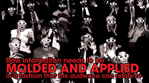
Anyone can regurgitate information though a camera and on to a television set that will ultimately go in the audiences short term memory only to be forgotten minutes later. Raw information needs to be molded and applied in a fashion that the audience can relate to and also in a way they might find interesting. A good concept allows us to do exactly that.
A concept can mean any number of things; from a story-line with a character animation, to a cutting edge visual style that your video could be executed in. There are a number of methods we can utilize to make videos that are engaging for the viewer to watch. Any production company can gear up with ultra-hightech video cameras and make you a professional looking corporate video. But is that going to truly be what makes your customer remember it, is it going to be what makes the customer act upon what they have seen? Without the foundation, or the concept, you cannot build the frame. After all, it is ideas and concepts that allow you to stand out in a media saturated world.
In regards to film and video, a good concept is created by taking into account a clients goals and expectations, their target market, branding, and most importantly what they want to communicate to their audience. We take into account all those various things and brainstorm on how we can communicate that message in an interesting way.
Monday, September 14, 2009

Saturday, September 5, 2009
Thursday, August 27, 2009
Emerson...
Ralph Waldo Emerson from chris hamilton on Vimeo.
A personal piece I created based off a Ralph Waldo Emerson Quote. I'd like to take out the lens flare because I hate lens flares and don't know why I insist on adding them.
The Modern Monkey... just a hiphop junkie.
The modern monkey... he's a hiphop junkie. from chris hamilton on Vimeo.
Another entry for Greyscale Gorilla's five second project. This time the theme was "Modern Monkey." I wasn't a huge fan of the theme, mainly because I couldn't come up with a good concept... it was challenging. But once I had a concept, I had a blast animating it.
Thursday, August 20, 2009
Your Brand - It's Like Getting Dressed in the Morning.

Branding has become a dominant term in the world of commerce. Its definition varies depending on who you ask, but is typically thought of as a company's identity in the eye's of its consumers. It has an uncanny ability to communicate what you or your company does, the quality that you produce, and the manner in which you achieve those results. Ultimately branding is the impression, whether conscious or subconscious, that you leave in the minds of everyone who interacts with your company.
Humans more often than not, are a highly visual and judgmental species. What we see, allows us to form judgments and biases based on what we see and encounter on a daily basis. For example, if we see a dark alley late at night, we typically think of it as an unsafe place to go. The alley's brand late at night relates very much to its visual indicators: dark, dirty, abandoned, not to mention the creepy guy in the trench coat who's giving you weird looks. These indications have become associated with how the alley might be unsafe and something we have learned to be fearful of, regardless if those fears are justifiable or not. These fears and biases will ultimately help us to decide if walking down the alley is a good idea or a bad idea. These kinds of biases encompass how we interact with certain individuals, groups of people, and how we interpret the world around us. Branding allows artists and designers to manipulate this aspect of human perception to help shape other people's opinions of ourselves, and the companies we either work for or own - hopefully for the better.
Simply put, branding is like the clothing you wear, only it's for your company. Do you want your company dressed like a bum or dressed to the nine's? The answer is obvious, but the question is how can we go about creating a successful brand?
Having a solid brand, especially in an increasingly brand aware world is going to be paramount to your success in the long run. Most Fortune 500 companies are aware of this and they attempt to use it to their advantage, some succeed more so than others depending on your personal opinion. Your brand encompasses everything from your visual identity, to the culture of your work place, to the experiences your clients have with you. For the purposes of this article, we will be tackling the visual aspects of your brand.

Your company logo is a key piece in creating a successful brand for your company, it can be equated to the kind of shirt you put on this morning. Is the shirt dirty? Does it have holes in it? What is on the shirt, any graphics, colors, or patterns? Is it nicely ironed? We can create an impression in our mind based on how someone is dressed that will lead us to assume certain things about the person that may or may not be true. If we see someone in a nicely pressed white collar shirt we can assume that the person might be a successful business person, someone who is intelligent and competent.
For a large part our experiences in life have taught us to react in one fashion or another based on those impressions. Your logo, as mentioned before, can be thought of like the shirt you are wearing. Was your logo custom tailored by a professional who knows how to use color, shape, line, typography, and iconography to clearly communicate the positive aspects of your company? Or was it designed by an amateur who gave no thought to how it would be perceived in the eyes of the public?
One of the most prolific examples, as well as one that truly has a historical impact, is the importance branding played in the 2008 Presidential Election.

Historically, campaign branding and design has not been something that has played a tremendous role in the outcome of elections seeing how most campaigns typically didn't have much associated branding other than typographic red and blue signs. This election was slightly different however.
The Obama campaign which was trying to capitalize on the youth vote, and they understood the importance of having a good brand in attracting the eyes of a generation that has been exposed to brands virtually all their life. They decided to hire a prestigious Chicago based design agency VSA Partners to help themselves differentiate from current and past presidential campaigns. The visual style of the opposing campaigns are rather clear cut. McCain's campaign had the run of the mill, typical campaign look to it. Whereas Obama's had a new, more modern look to it - a look that is reflective of the Web 2.0 generation. Obama's logo also was one of the first to include any sort of iconography within it which all lent itself to his message. It was the first campaign to really brand itself according to how it wanted to be perceived to their target market, and was quite successful in doing so.
As most political campaigns go, each side states that it is going to bring "change" to the political arena. Whether Obama will truly bring that change is a matter of political opinion, but his branding was the first to really speak about that change and hope that he had promised. How could we believe McCain's campaign, seeing how his branding was so much like all the predecessors before him? If he looks like all the politicians before him, he will most likely just be more of the same, right? Obama's campaign capitalized on this fact, and made a point of difference to set themselves a part. Apparently it worked because he is now the 44th President of the Unites States, and it would be safe to assume that his campaign has changed the way we think about branding and the political process.
So what exactly does a logo contain that helps create a successful brand?
There are many schools of thoughts, and it is a very subjective topic - everyone has their own opinion and we all respond to things differently. However, there are certain traits that leading brands have within their logos. Having said that, we also need to note that societal perceptions are constantly changing, adapting, and responding to everything else that is going on, which is why some brands are updated every now and again.

The first trait is that most logos are simple. You want your logo to be as economical as possible, but still maintain resonance within your audience's mind. You want to be able to communicate your message in one quick glance. In the case of Obama's logo, they used the sun rising on the horizon which was comprised of red stripes. A simple message being that we've awoken to a new era in government, and that hope is on the horizon. You could go on interpreting it however you see fit, the important thing is that it communicates a lot of information in a rather simple form. Not to mention the "O" in which the icon lies, obviously standing for Obama.
The second trait is that it should be timeless. A lot of amateur designers typically create their first logos in styles that are popular or relevant at the time, only to have their clients frustrated later on because down the road they just look dated. Certainly, some designers play into this aspect and some logos may not be used over a long period of time. Ideally, for most corporate logos, longevity is a must so your logo cannot be reflective of the current fads happening at the moment. They should still be consistent with the market's taste however, but that is also fleeting. One example of a widely known brand and logo is Coca-Cola. They're logo hasn't changed for over 100 years and it's still relevant to this day.
The third trait is that is should be executed by a professional. Often times people underestimate the role of the designer in creating a successful brand and they often think that anyone can design a logo. Sometimes they're right, most of the time they're wrong. Designers have a great deal of knowledge that can help alleviate some of the difficulties of creating a successful brand down the road. Some of that knowledge includes understanding the historical relevance of the typeface that is used in your logo, or knowledge of color theory and an understanding of how humans react to and perceive various shades of green. For the most part, when starting a company, or redesigning your logo, just leave it to a pro. It might cost more, but it will pay off down the line.
Not only is your brand communicated through your logo, which we could equate to the shirt you may or may not be wearing at the moment. But it also encompasses all the other printed material, web, video, and signage that you might posses as a company. Which is why, once again, that it is so crucial that you work with designer's who know what they're doing. You want your brand to be consistent across all the various media's just mentioned and professional designer will make sure that it is accomplished.
Subscribe to:
Posts (Atom)